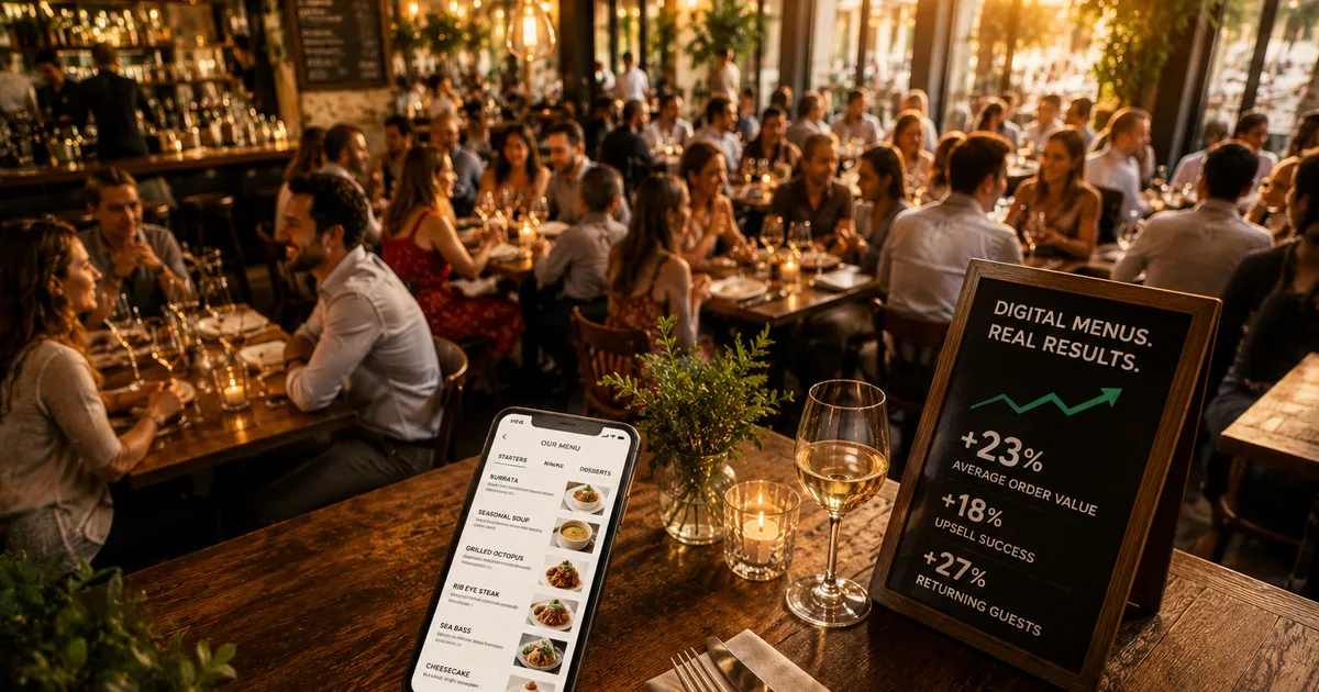
It is one of the first questions restaurateurs ask before switching: will a digital menu actually sell more, or is it just a tidier way to show the same dishes? It is a fair question, and it deserves a fair answer. The honest version is that the public evidence is uneven. Some of it comes from solid platform data and peer-reviewed studies. A lot of it comes from vendor blogs repeating each other. This article separates the two, names every source, and tells you which numbers to trust and which to treat as directional.
We have only used figures we can attribute to a named publisher. Where a number is self-reported or comes from a commercial source, we say so. Where the research is thin, we keep the point qualitative rather than invent a statistic. That is the only honest way to answer a question like this one.
The headline numbers, at a glance
Here are the most-cited figures, each tied to its source. Read the rest of the article for the context and caveats behind each one.
Notice the spread in source quality already. The 3x photo figure is primary platform data. The 27 percent label figure is academic but carries a caveat. The 15 to 20 percent check figure is a vendor claim with no independent study behind it. We will treat each accordingly.
Photos and average order value
The single best-supported claim is also the most important one for restaurants: people order what they can see. According to Uber Eats, in its own merchant academy, menus that include item photos are three times more likely to be ordered from than text-only menus. Uber Eats attributes this to 2019 global data for non-POS-integrated restaurants under 20 locations, so it describes a delivery storefront rather than a dining room, but it is one of the few photo-impact figures that traces to a primary source rather than a marketing blog.
The behaviour shows up in survey data too. According to DoorDash, in its 2024 Restaurant Online Ordering Trends Report, 38 percent of customers say they look at photos when choosing a new restaurant, and 46 percent of Gen Z and 41 percent of millennials use food photos to drive purchasing decisions. These are self-reported figures rather than observed sales, so they tell you what guests believe influences them, which is useful but not the same as a measured lift.
Academic work points the same direction. A peer-reviewed study by Hou, Yang and Sun, published in the International Journal of Hospitality Management in 2017, found that adding a picture to a dish with a common, descriptive name positively affected diners' attitudes, their willingness to pay, and their purchase intentions. The study reports a directional effect rather than a single headline percentage, which is why we describe it qualitatively: photos helped, especially when paired with a clear name.
There is a useful counterpoint worth keeping honest about. Research summarised in the food-photography literature on PMC found that participants were willing to pay about 6 percent more for real food than for a depiction of it. The practical lesson is that a photo sets an expectation the plate then has to meet. A good photo of an honest dish helps. A glamorous photo of a dish that arrives looking nothing like it does the opposite. This is exactly why we only ever use real photos of the real plate. Our guide to restaurant menu photos covers how to shoot a full menu honestly, without a studio.
Wording does work the photos cannot
Photos are not the only lever. The canonical academic figure on menu wording comes from a six-week field study by Brian Wansink and colleagues at the Cornell University Food and Brand Lab, reported via FoodService Director: items given descriptive, sensory labels sold 27 percent better than identical items with plain names. One honest caveat: the study's lead author later had several unrelated papers retracted, so we treat the exact 27 percent as indicative rather than definitive. The broader, repeatedly observed point still stands: how you describe a dish changes how often guests choose it.
A digital menu makes that lever practical to pull. You can rewrite a description in seconds, test a clearer name, and watch what happens, none of which is realistic when every change means a reprint.
Tourists, languages, and confident ordering
This is a section where the public data is thin, so we will keep it qualitative rather than reach for a number we cannot source. We have not found a credible, attributable statistic on the precise revenue lift from automatic menu translation, so we will not invent one.
What we can say plainly is the mechanism. A guest who can read the menu in their own language, see what a dish looks like, and check allergens orders with more confidence and asks fewer clarifying questions. A guest who cannot read the menu tends to default to the one safe dish they recognise, which is rarely the most interesting or the highest-margin choice. Removing that friction is the point of translation on a digital menu, and in a tourist-facing room it is one of the most visible day-to-day changes. We have framed this as a behaviour, not a percentage, on purpose.
Table turnover and labour
Self-paced ordering is often sold on speed: guests browse, order, and pay on their own clock instead of waiting for a server. Some QR-ordering vendors, including Lithos POS and Call the Service, report table-turnover improvements of around 15 percent in their case studies. We flag clearly that these are vendor blog claims with no independent study behind them, so they are best read as marketing estimates rather than measured results.
The same caution applies to check size. QR-ordering vendor blogs such as Lithos POS and NovaTab claim a 15 to 20 percent higher average check with self-paced QR ordering, attributed to unhurried browsing and built-in suggestions. The logic is plausible, and it lines up with the better-sourced photo findings above, but the specific percentage is unverified by independent research. Use it as a hypothesis to test in your own room, not as a guarantee.
Print cost and agility
The clearest financial case for digital is not extra revenue at all, it is removed cost. Here, too, the available figures come from commercial sources, so they are illustrative ranges rather than measured averages. Menu-printing and menu-management vendors such as TerraSlate and MenuMate estimate that a 50-table restaurant spends roughly 2,400 to 4,800 dollars a year on menu printing, and that all-in paper-menu costs often land between 5,000 and 10,000 dollars a year once reprints, replacement of damaged copies, storage, and staff time are added up. MenuMate also estimates that the average restaurant throws away 500 to 1,000 menus a year due to wear, spills, and outdated information.
Two honest notes. First, those dollar figures are vendor estimates, not surveyed averages, and they describe a US context, so a European bistro will see different numbers. Second, the real value is not only the euros saved on paper. It is agility: a price change, a sold-out dish, or a new special goes live in seconds instead of waiting for the next print run, which means your menu stops drifting out of date with your kitchen. We work through the full cost picture, including where paper still wins, in our digital menu versus paper menu comparison.
What guests actually click
Most of the figures above describe what guests do on someone else's platform. The more useful question for your restaurant is what your own guests do on your own menu, and that is something a paper menu can never tell you. A digital menu records which categories get opened, which dishes get viewed, and which sit untouched for weeks. That is not a vanity dashboard. It is the feedback loop that tells you which descriptions to rewrite and which photos to reshoot.
This is where the sourced findings become actionable. If photos lift ordering and descriptions lift ordering, then the dishes your guests ignore are the ones to fix first, with a better photo, a clearer name, or a different position. Our guide to restaurant menu analytics covers the handful of numbers worth watching and the concrete change to make when a dish underperforms.
How to read these numbers
Before you take any figure here to the bank, four caveats are worth holding in mind.
- Correlation is not causation. Menus with photos being ordered from more often does not prove the photo caused the order. Restaurants that invest in photos often invest in everything else too. The effect is real and consistent, but the exact share attributable to the photo alone is hard to isolate.
- Source quality varies a lot. Platform data (Uber Eats, DoorDash) and peer-reviewed studies sit at one end. Vendor blogs sit at the other. We have labelled each figure so you can weight it. A widely repeated trade-press range of roughly 25 to 30 percent more orders for items with photos, for instance, appears across restaurant-tech blogs but we could not trace it to a verifiable primary study, so we have not used it as a headline figure.
- Most figures are about delivery, not dining rooms. The strongest photo data comes from delivery apps. The behaviour carries over, but your in-restaurant results will differ.
- Your room is the only sample that matters. Averages hide enormous variation. The only way to know whether a digital menu lifts your sales is to run it and watch your own analytics.
What Opnclo actually measures
We built Opnclo so you do not have to take any of these averages on faith. Instead of guessing, you see your own numbers: which dishes get viewed, which get ignored, which photos and descriptions are pulling their weight, and how that changes when you adjust them. The sourced findings in this article tell you which levers tend to work. Your own analytics tell you whether they are working for you.
The figures from Uber Eats, DoorDash, and Cornell point in the same direction (photos and clear descriptions help guests order), but a national average is not your restaurant. The honest promise is not a guaranteed percentage. It is a menu that is faster to update, easier to read, and measurable, so you can make small, evidence-led changes and see what they do.
If you want to weigh the full trade-off first, including where paper genuinely still wins, read our digital versus paper comparison, or see plans and pricing on the pricing page. You can also browse live examples on our restaurants directory to see how digital menus look in practice.
Frequently asked questions
Do QR menus really increase sales?
The most defensible evidence is about photos, not the QR code itself. According to Uber Eats, menus with item photos are three times more likely to be ordered from than text-only menus. Peer-reviewed research by Hou, Yang and Sun (2017) found that adding a picture to a descriptively named dish raised willingness to pay and purchase intention. Claims of a 15 to 20 percent higher average check from self-paced QR ordering come from vendor blogs (Lithos POS, NovaTab) and are marketing estimates, not independent studies. So the ingredients of a digital menu are linked to more ordering, while the specific revenue percentages are largely self-reported or vendor figures and should be treated as directional.
How much do dish photos affect ordering?
According to Uber Eats, menus with photos are three times more likely to be ordered from than text-only menus (2019 global data for non-POS-integrated restaurants under 20 locations). According to DoorDash, 38 percent of customers say they look at photos when choosing a new restaurant, and 46 percent of Gen Z and 41 percent of millennials use food photos to drive purchasing decisions. These are delivery-platform figures, so they apply most directly to online ordering, but the underlying behaviour carries over to an in-restaurant digital menu.
Do digital menus save money on printing?
Vendor estimates suggest meaningful savings, though they are commercial sources rather than measured averages. According to menu vendors TerraSlate and MenuMate, a 50-table restaurant spends roughly 2,400 to 4,800 dollars a year on menu printing, with all-in paper-menu costs often estimated at 5,000 to 10,000 dollars a year once reprints, replacements, storage, and labour are included. MenuMate also estimates the average restaurant discards 500 to 1,000 menus a year. Treat these as illustrative ranges from vendor blogs.
Which statistic here is the most trustworthy?
The Uber Eats 3x photo figure and the Hou, Yang and Sun (2017) peer-reviewed study, because they come from primary platform data and academic research rather than companies selling menu software. The turnover, check-size, and print-cost figures all come from vendor blogs and should be treated as directional.