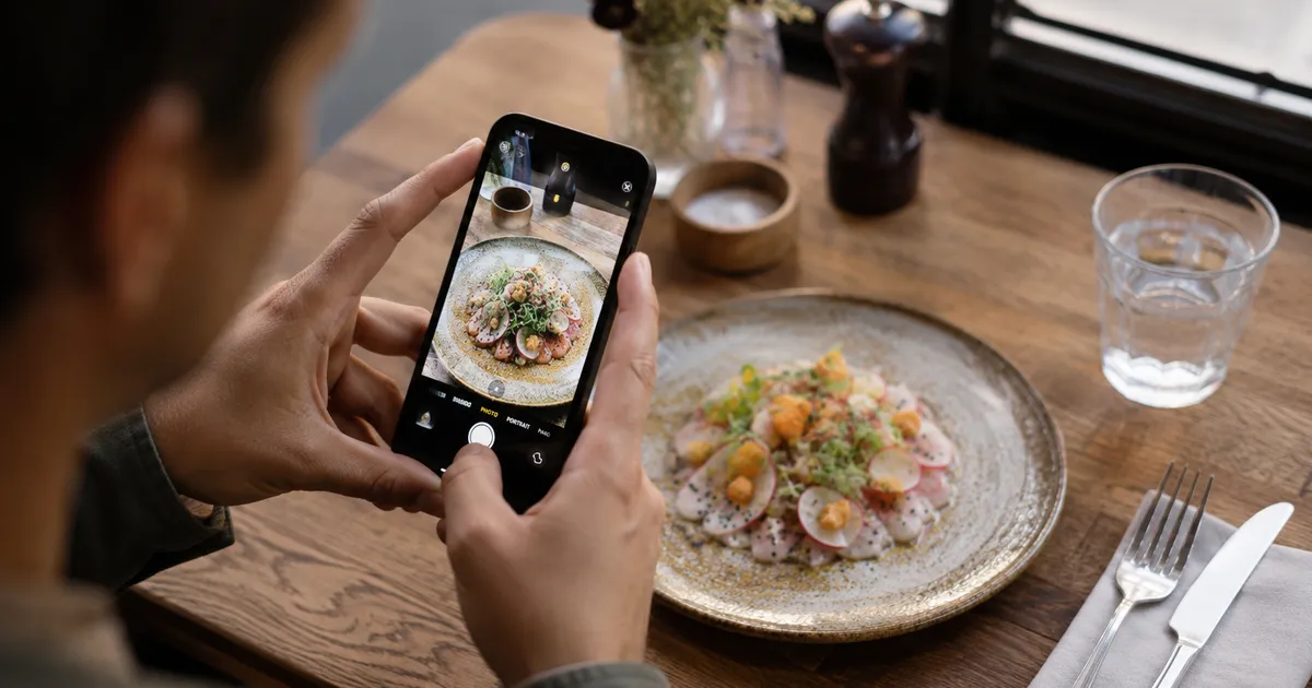
The single highest-leverage upgrade most restaurants can make to their menu is also the one most owners delay the longest: photos of the dishes. Not because they are difficult to take, but because food photography sounds like something you hire a professional for. You do not, at least not for the everyday menu. A phone made in the last three years, a window with good light, and one focused hour will get you eighty percent of the way to a menu that quietly sells more.
This is the practical version of the guide. No studio talk, no thousand-dollar lens recommendations, no Instagram lifestyle posing. It is the workflow a restaurant owner can run on a Tuesday morning before service.
Why photos move the needle
Diners scanning a menu (paper or digital) make most of their decisions in under ninety seconds. In that window, the brain reaches for shortcuts. A photo is the shortest shortcut available. It tells the guest what the dish actually looks like, how big it is, how it is plated, and whether it matches what they want. Without a photo, the guest defaults to the dish they already know, which is almost always not the one with the best margin.
Industry data from Toast and the National Restaurant Association consistently shows that menu items with photos are ordered 25 to 30 percent more often than identical items without. On digital menus, where photos are larger and easier to display, the effect is stronger still. The same dish, photographed and described, sells noticeably more than the same dish described in text alone.
A digital menu has one further advantage over a printed laminated card: you can update photos as often as you want, swap them out seasonally, and test which version sells better. This is impossible with printed photos. It is one of the quiet reasons digital menus convert more orders per cover.
Light is ninety percent of the photo
If you remember one thing from this guide, remember this: food photography is light photography. Everything else (composition, styling, editing) is a distant second. Get the light right and the dish will look good even with an average camera. Get the light wrong and no editing app will save you.
Natural light wins, almost always
The best light for food is bright but indirect daylight, the kind you get next to a north-facing window at late morning. It is soft, even, and renders colours faithfully. Direct sunlight, by contrast, creates harsh shadows that make sauces look greasy and proteins look dry. The overhead fluorescent lighting in most professional kitchens flattens colours and casts a greenish tint that no filter can fix.
If your dining room faces south and floods with hard sun at midday, do not shoot there. Find a window in the service area, the office, or even the staff break room, and set up a small table by it. Diffuse the light through a sheer white curtain or a piece of baking paper taped to the window. The result will look like a magazine.
The five-minute lighting setup
Put a clean table against a window with the long edge facing the light, not the camera. Light should come from the side, not from behind the camera. This creates gentle shadows that give the dish dimension. If shadows on the opposite side feel too dark, prop up a sheet of white printer paper or a foam board to bounce light back into them. That is the entire setup. No softboxes, no rings, no continuous LED panels.
What to avoid
Avoid mixed lighting. If you have a window and overhead bulbs on at the same time, the two colour temperatures fight each other and the photo comes out muddy. Turn the overhead lights off, even if the room is darker for it. Avoid flash. Phone flash creates a flat, ugly, over-exposed plate and kills every shadow that would have given the dish life. Avoid coloured walls reflecting onto the food. A red wall behind the camera tints every sauce pink.
Angles: pick the one the dish wants
There are three angles that work, and each one suits a different family of dishes. Choosing the right angle is half of composition; the rest is framing.
| Angle | Best for | Why it works |
|---|---|---|
| Overhead (90 degrees) | Pizza, salads, bowls, pasta, sharing plates, flat-lay assortments | Shows the full surface, the toppings, the proportion of ingredients. No height to display. |
| Three-quarter (25 to 45 degrees) | Burgers, sandwiches with layers, parfaits, plates with garnish on top, soups with visible toppings | Shows height and surface together. The natural eye angle. Works for 70 percent of menu items. |
| Side (0 to 15 degrees) | Cocktails, beers, layered drinks, tall desserts, club sandwiches, vertical builds | Emphasises height and stack. Makes drinks look refreshing and tall dishes look architectural. |
When in doubt, the three-quarter angle is the safe choice. It mimics how the dish looks to a seated guest, which means the photo matches the expectation when the plate arrives at the table. This matters: a photo that flatters too much, then disappoints in person, hurts trust on the next visit.
Composition: keep it boringly simple
Restaurant menu photos are not editorial cookbook photos. The job is to show the dish clearly, not to tell a story. The simpler the composition, the more it sells.
Centre the dish
Forget the rule of thirds for now. On a small menu thumbnail, especially on a phone screen, centred compositions read faster and waste less space on background. Put the plate in the middle of the frame, fill 60 to 80 percent of the image with food, and crop tight.
Choose a quiet surface
A solid wood table, a neutral linen napkin, or a plain marble counter beats any patterned tablecloth. Patterns compete with the dish and date the photo. If you do not have a good surface in the restaurant, a single piece of plywood sanded smooth, or a 60 by 60 cm marble tile from a hardware store, will get you through a thousand photos.
One or two props, no more
A folded linen napkin, a single glass, a fork resting next to the plate. That is the ceiling. Forks held by hands, multiple wine glasses, candles, flowers, branded coasters: they all compete for attention and make the dish look smaller. The dish is the star. Everything else is a distraction unless it directly relates (a small bowl of dipping sauce, the bread basket the bruschetta came from).
Show scale only when it matters
If your burger is genuinely large, put a hand or a knife nearby for scale. If it is a normal size, do not. False scale is the most common credibility killer in restaurant photography.
Style the plate before you shoot
The kitchen plates a dish for the table, not for the camera. The two are not the same. Spend an extra thirty seconds on each dish before shooting and the photo improves immediately.
Wipe the rim
A clean rim makes the plate look professional. A drop of sauce, a smudge of oil, a fingerprint: all visible in a close-up, all distracting. Keep a folded cloth and a small bottle of water next to the camera.
Place garnish last, deliberately
The herb, the drizzle, the flake of salt. These should go on after the plate is in the frame and you have checked the composition. They are the final hero element. A perfectly placed micro-herb or a single ribbon of olive oil draws the eye exactly where you want it.
Shoot the dish hot, fast
Steam fades, cheese congeals, sauces dull, herbs wilt. The window from plating to good photo is about four minutes for hot food and about two minutes for anything with melted cheese. Have the camera framed and exposed before the dish leaves the pass, not after.
A small spritz of oil revives a tired dish
If a plated dish is starting to look dull, a light brush of neutral oil on visible proteins or vegetables restores a fresh, glossy look. This is a styling trick, not a food safety issue: the dish you photograph is the dish staff eat afterwards.
Phone camera settings that matter
Modern phones do most of the work automatically, but a few manual tweaks consistently produce sharper, more accurate photos.
- Tap to focus on the front of the dish. Phones default to centre focus, which often falls behind the front edge. Tap exactly where you want the eye to land.
- Use the standard (1x) lens for most shots. The ultrawide lens distorts close-up food. The 2x or 3x telephoto compresses pleasantly and is great for three-quarter angles, but only if the light is strong.
- Turn HDR on. Modern HDR balances bright window light and shadow without making the photo look fake. Leave it in auto.
- Shoot in the highest resolution (HEIF or JPEG, full-size). You can always downscale. You cannot up-rez.
- Skip the built-in food filters. They oversaturate reds and yellows. Edit later, with restraint.
- Use a small tripod or a stack of books if your hands shake, especially indoors. Phone shutter speeds drop to 1/30s in dim light, which is below the handheld limit.
Edit lightly, never dramatically
Editing is where most amateur food photos go wrong. The temptation is to crank the saturation and warmth until the dish looks like it is on fire. Do not. Edited-to-death photos make guests distrust the photo, then distrust the menu, then distrust the restaurant.
Stick to four adjustments, in this order, with light touches:
- Exposure: bring it up just enough that the brightest parts of the dish are crisp white but not blown out. Most phone photos shot indoors need 0.3 to 0.7 stops up.
- Contrast: a small bump (10 to 20 percent) gives the dish dimension. More than that crushes shadows.
- White balance: nudge towards warmer if the dish looks cold, cooler if it looks orange. The goal is "what it looked like in the dining room," not "what looks good on Instagram."
- Crop: tighten to put the food at the centre of attention. Square (1:1) and 4:5 vertical work best on digital menus because they fill the card on a phone screen.
Use the native Photos app on iPhone or Snapseed on Android. Both are free and good enough. Skip Lightroom presets sold by influencers: they are designed for moody coffee shots, not for plates of pasta on a Tuesday lunch.
The one-session workflow for an entire menu
Most restaurants drag photography out over weeks. There is a faster way: shoot the whole menu in one focused morning. Done right, this takes two to three hours and produces enough images for a year.
- Prep the list the day before. List every dish you want to photograph, prioritised by sales rank. Top sellers and signature dishes first. Skip items you do not want to feature.
- Set up the lighting station once. One table, one window, one surface, one phone on a tripod. Do not move it for the whole session.
- Brief the kitchen. The chef plates each dish exactly the same way it would arrive at table. No "extra garnish for the camera." Real photo, real dish.
- Shoot in a logical order. Cold dishes first (salads, charcuterie), then warm starters, then mains, then desserts. This matches kitchen workflow and minimises cooling time.
- Take five photos per dish. Three at the chosen angle, two alternatives. You will pick the best one later. This costs nothing on a phone.
- Pause after every fifteen dishes to review on a larger screen. Sometimes a lighting drift or a smudged lens reveals itself only on a tablet. Catching it early saves a reshoot.
- Eat what you shoot. Staff meal for the day is built in. This is what makes the workflow popular with the kitchen.
A focused team of two (one on the camera, one on plating and styling) can cover 25 to 35 dishes in three hours. The first session is the slowest. The second session, a quarter later, is twice as fast.
Common mistakes that quietly kill photos
- Shooting in the kitchen under hot lights. Yellow-green cast, no fix in editing.
- Forgetting to clean the phone lens. A fingerprint on the lens creates a soft halo that looks like a focus problem.
- Shooting after service has started. Rushed, hot dish goes cold, no time to style. Always before service.
- Cropping too tight. No breathing room on the plate makes the dish look cramped and small.
- Mixing photographed and non-photographed items on the same menu page. Items without photos disappear visually. Either photograph all of a section or none of it.
- Updating photos once a year. Seasonal menus and specials should be photographed within a week of their launch. Stale photos signal a stale restaurant.
How a digital menu uses the photos differently
This is where digital changes the rules. On a paper menu, you get one photo per dish, locked for the print run, sized small to fit the layout. On a digital menu, the same photo can be displayed full-width on a tap, swiped through alongside variants, swapped seasonally, and tied to analytics so you know which photo drove orders and which did not.
The implication is practical: photos on a digital menu have a higher return on the time invested, because each one is reused, refined, and tested. A weak photo can be replaced in seconds, not at the next reprint. A strong photo of a top seller pays back its time on the first service after publication.
For restaurants using QR code menus in particular, photo quality matters even more, because the menu is the entire visual interface between the guest and the kitchen. There is no host walking the table through the chalkboard, no printed photo prop on the bar. The phone screen does the work.
The bottom line
Food photography for a working restaurant is not art direction. It is hospitality at a distance: the photo is what the guest sees before deciding what to order, and it should look exactly like what arrives at the table. Honest, well-lit, simply composed.
One morning, one window, one phone, one chef plating with intent. The menu that comes out of that session will sell more than the one without photos, every shift, for as long as it stays current. That is the entire return on the work.